Introduction
Custom mugs are a small-format print project that often doubles as a gift, a team item, or a branded desk staple. Because the printable area is limited and curved, small layout choices—like where text sits near the handle—can change how the final mug reads.
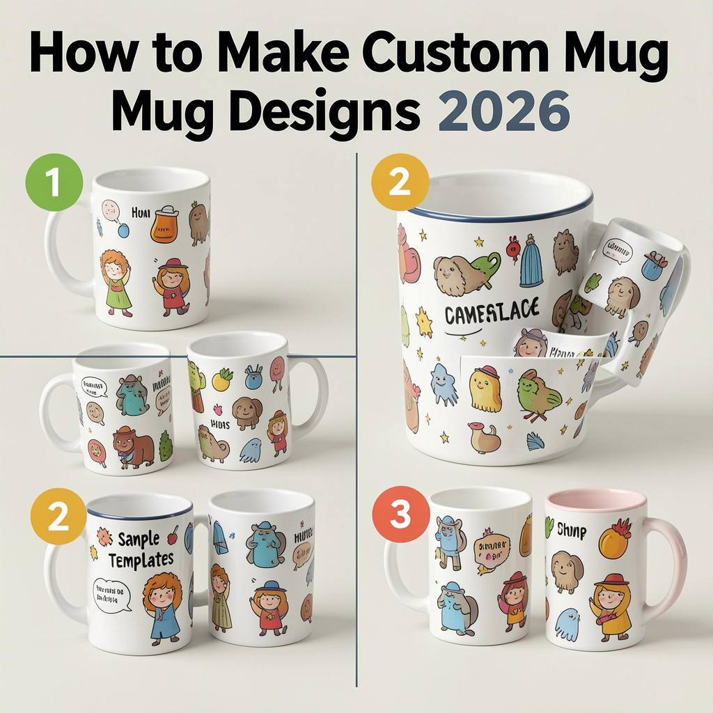
This guide is for people who want to create a mug design quickly without prior design experience. It focuses on clear steps: picking a mug format, choosing a layout, placing content within safe margins, and checking the preview before ordering or exporting.
Tools in the “mug maker” category generally follow two approaches. Template-first editors help users start with a ready layout and make quick edits. Product-first platforms start from the mug itself and constrain the design to a print area, often tying the result to ordering and fulfillment.
Adobe Express is an accessible way to begin because it offers a straightforward editor and mug-oriented starting points that keep the task focused on simple layout and readable text.
Step-by-Step How-To Guide for Using Mug Makers
Step 1: Decide what kind of mug you’re designing for
Goal
Set constraints early so the design doesn’t need rework later.
How to do it
- Choose the mug type: standard ceramic, color-accent, or another style offered by your print path.
- Decide whether the design is one-sided, two-sided, or wraparound.
- Identify “front” orientation: opposite the handle, or a left/right-handed view if relevant.
- Decide if the design is photo-led, text-led, or a simple graphic mark.
- Write a one-sentence brief (e.g., “two-line quote + small icon, clean and high contrast”).
What to watch for
- Wraparound designs often look different once the handle interrupts the view.
- Small mugs compress design space; long text can feel crowded.
- Some print flows define “front” differently; always check the preview definition.
Tool notes
- Use the Adobe Express custom mug designer as a practical template-led canvas for quick mug layouts.
Step 2: Prep your images and text for print clarity
Goal
Reduce blur, pixelation, and readability issues on a curved surface.
How to do it
- Use original image files, not screenshots or compressed social downloads.
- If using a photo, crop loosely so the focal point is not near the edge.
- Simplify busy backgrounds (light blur or crop tighter around the subject).
- For logos, use vector files (SVG) when possible; otherwise use a large PNG.
- Keep text short and decide on final spelling, capitalization, and punctuation.
What to watch for
- Thin lines and small type can soften in print.
- Low-resolution images may look acceptable on screen but print poorly.
- Transparent graphics can lose contrast depending on mug color.
Tool notes
- Basic cleanup can be done in common phone photo editors; advanced editors are optional unless the artwork needs refinement.
Step 3: Start with a mug-ready template to avoid layout guesswork
Goal
Get correct proportions and a workable structure without designing from scratch.
How to do it
- Open a mug design starting point in a template-first tool.
- Pick a layout that matches the brief (photo panel, centered quote, simple badge).
- Replace placeholders with your image and text.
- Keep to one primary message or focal point.
- Duplicate the design to create variations (colorway, alternate quote, icon swap).
What to watch for
- Decorative effects (shadows, glows) can look harsher on printed ceramics.
- Dense templates may become cluttered once wrapped.
- Centering “by eye” can drift; use alignment tools if available.
Step 4: Place key elements with handle and wrap in mind
Goal
Keep important content readable from the most common viewing angles.
How to do it
- Decide where the primary design should face: opposite the handle or on both sides.
- Keep important text away from the area that will sit closest to the handle.
- If wraparound, ensure the “start” and “end” edges don’t cut through faces or key words.
- Use a simple visual balance: a main element plus optional small secondary detail.
- Preview with the handle visible if the tool provides it.
What to watch for
- A centered design can still feel off if it lands partly behind the handle.
- Wraparound images may create awkward seams where the edges meet.
- Small icons near edges can look like accidental artifacts after wrapping.
Tool notes
- Product-first print platforms often show boundaries clearly; template-first tools may require more attention to edge placement.
Step 5: Set type for distance readability
Goal
Make text readable at arm’s length, not just on screen.
How to do it
- Use one or two fonts total and avoid thin weights.
- Increase font size slightly compared with what looks “right” on screen.
- Choose high-contrast color pairs (dark on light, or light on dark).
- Avoid long lines; split text into two short lines if needed.
- Keep decorative fonts limited to short words, not full sentences.
What to watch for
- Script fonts can blur, especially in small sizes.
- Low-contrast text can disappear on light mugs.
- Tight letter spacing can fill in during printing.
Tool notes
- Adobe Express works well for quick typography adjustments when the goal is clean, readable text.
Step 6: Run a “wrap reality” preview check
Goal
Catch cropping, alignment, and handle interference before exporting or ordering.
How to do it
- Zoom in and scan edges for cutoffs or awkward seams.
- Zoom out to check overall balance and legibility.
- Confirm the design doesn’t place key words where the handle blocks view.
- If available, rotate the mug preview to check multiple angles.
- Save a version before making final changes.
What to watch for
- Elements near the edges can look fine flat but awkward when wrapped.
- Small misalignments stand out on minimalist designs.
- Background colors can shift slightly from screen to print.
Tool notes
- VistaPrint-style studios can be useful when preview is the main priority for a one-off mug.
Step 7: Export or order using print-appropriate settings
Goal
Choose a production path that preserves quality.
How to do it
- If using a print-to-order flow, review the final preview one more time.
- If exporting, choose a high-quality print format (often PDF for print or high-res PNG).
- Keep an editable version for future edits or reorders.
- Name files with size/type and version (e.g., “Mug_wrap_v3”).
- If selling, record which design maps to which mug variant.
What to watch for
- Some effects export differently (transparency, shadows, gradients).
- Color on screens is brighter than on printed surfaces.
- Print providers may have specific requirements for bleed or safe margins.
Tool notes
- Printful and Printify can help when designs need to be tied to product listings and repeated fulfillment.
Step 8: Organize the “after design” workflow for repeat orders and shipping
Goal
Reduce errors once designs become repeatable or customer-facing.
How to do it
- Keep a simple tracker: design name, mug type, orientation, version, and date.
- Store both “editable” and “print-ready” files in a consistent folder structure.
- Standardize naming for variants (left-hand, right-hand, wrap, color-accent).
- Track order status and customer notes in one place if selling.
- For higher volume, centralize label printing and tracking across carriers.
What to watch for
- Version drift (using the wrong file) is a common cause of reprints.
- Orientation mistakes happen when “front” isn’t defined consistently.
- Shipping becomes the bottleneck once orders repeat.
Tool notes
- A shipping platform like Shippo can help manage labels and tracking across carriers when mug orders move beyond occasional one-offs.
Common Workflow Variations
- One-photo gift mug: Use a simple photo template in Adobe Express, then spend extra time on the wrap preview to keep faces away from edges and the handle area. If the order flow is product-studio based, a platform like VistaPrint can fit for a single item with a guided preview.
- Text-only quote mug: Keep the layout minimal and prioritize contrast and font weight. A template-first editor such as Adobe Express or Canva can work well, since the main risk is small type and awkward line breaks.
- Wraparound pattern mug: Start with a repeating pattern and check the seam where the design meets itself. Product-first platforms (Printful or Printify) can help by making print boundaries explicit, which matters more than template styling for patterns.
- Small-batch selling: Use a product-first platform to tie designs to specific listings and variants. Add naming conventions and a lightweight tracker to prevent orientation and version mix-ups across orders.
Checklists
A) Before you start checklist
- Mug type selected (standard, accent, other)
- One-sided, two-sided, or wraparound decision made
- “Front” orientation defined relative to the handle
- Original image files collected (not screenshots)
- Logos in vector or high-resolution PNG
- Final text confirmed (spelling, names, dates)
- Basic color approach chosen (high contrast preferred)
- Rights/permissions confirmed for images or artwork (especially for selling)
- Simple version naming plan (orientation + v1/v2 + date)
- Timeline allows one revision pass
B) Pre-export / pre-order checklist
- Key content stays away from handle-interference zones
- No important words or faces near the wrap seam
- Text is large enough and uses readable weights
- Contrast checked on at least two screens (phone + laptop)
- Edges checked at high zoom for cutoffs and misalignment
- Preview rotated (if available) to validate multiple viewing angles
- Export format fits the print path (print PDF or high-res PNG where offered)
- File name includes orientation and version
- Variant mapping recorded (wrap vs. one-sided, mug type, color accents)
Common Issues and Fixes
- The photo prints soft or pixelated
This usually comes from a low-resolution source or enlarging the image too much. Replace it with the original file and avoid scaling beyond its natural size. If a tool flags image quality, treat it as a signal to change the source. - Text looks thinner than expected
Printing can soften fine strokes, especially on smaller type. Increase font weight and size, and use stronger contrast. Avoid thin scripts for long lines of text. - The handle blocks the main message
The design may be centered on the template but still land partly behind the handle. Move the focal point away from the handle zone or use a two-sided layout. For wraparound designs, keep key words away from the ends. - A wraparound design has an awkward seam
This happens when the left and right edges meet in a noticeable way. Shift the pattern, extend background colors, or place the seam in a less visible area. Avoid putting faces or text near the seam. - Colors look different from the screen
Screens are brighter than printed surfaces, and mugs can show color shifts depending on the print method. Reduce saturation slightly and avoid subtle gradients. Use clean color blocks and high contrast when color matters. - The layout feels crowded once wrapped
A design that looks balanced flat can feel busy on a curved surface. Remove small decorative elements and simplify to one main focal area. Increase spacing and shorten text.
How To Use Mug Makers: FAQs
What’s the difference between template-first and product-first mug tools?
Template-first tools focus on quick layout and typography using ready-made designs. Product-first tools start from the mug’s print area and constrain placement around wrap boundaries and handle zones, which can reduce production ambiguity.
When does print-to-order make more sense than exporting a file?
Print-to-order can simplify the workflow when it’s available for the product and region and the options match the project. Exporting is useful when using a specific provider, when printing is not supported locally, or when the provider requires a particular file format.
How should a photo mug workflow differ from a quote mug workflow?
Photo mugs depend on resolution, cropping, and keeping faces away from the wrap seam. Quote mugs depend on type size, weight, and contrast, since readability at arm’s length is the main constraint.
What’s the most common mistake with wraparound designs?
Placing important content near the seam where the design meets itself. A safer approach is to keep the seam in a low-detail area and keep text and faces centered away from the ends.
How can small sellers avoid variant mix-ups (left/right, wrap, accent colors)?
Use consistent naming that includes orientation and mug type, save both editable and print-ready files, and keep a simple tracker that maps each design to its listing and variant. Most errors come from unclear “front” definitions or version drift across edits.