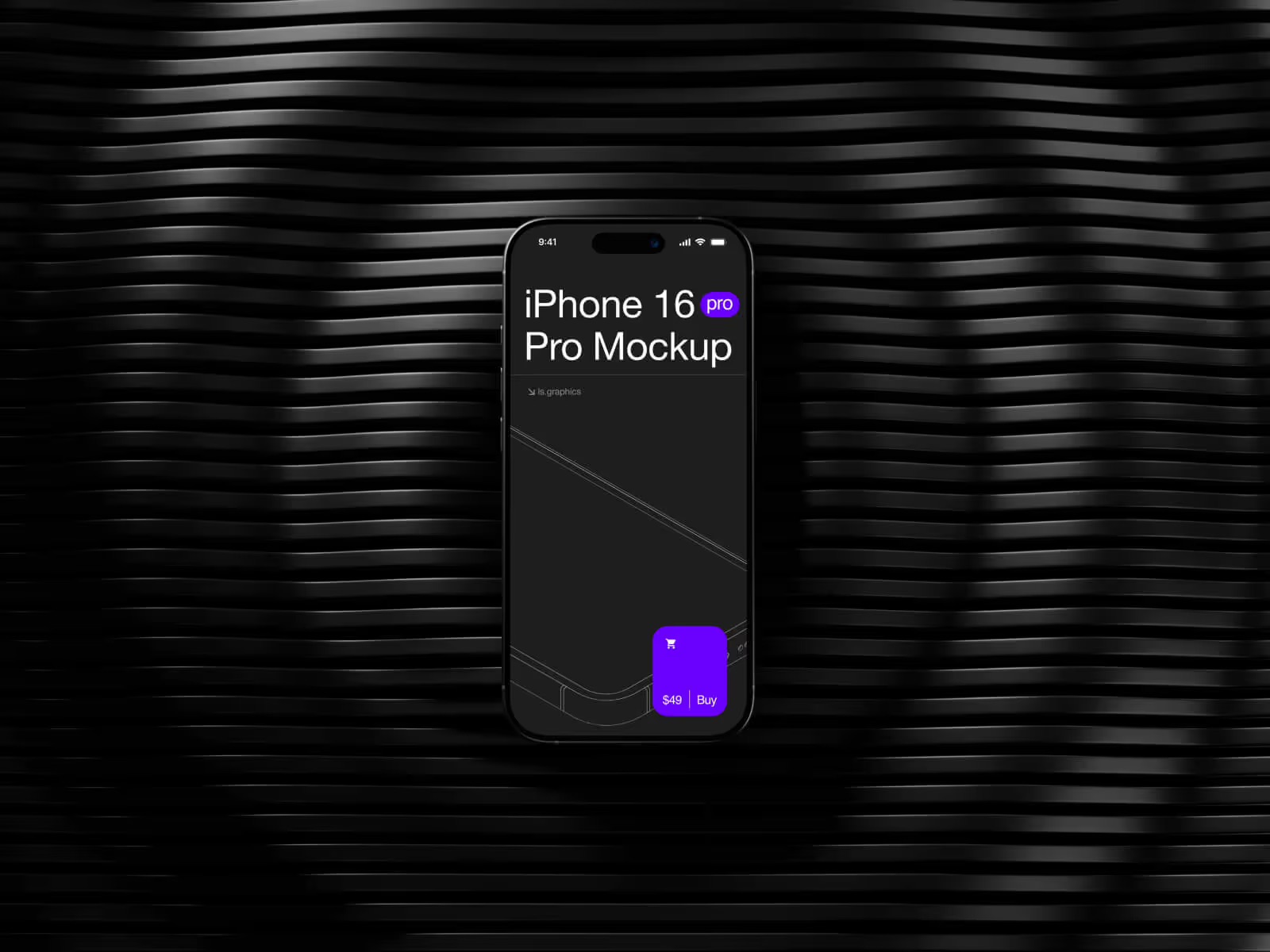
Scroll through the Instagram feed of any major app brand — Spotify, Notion, Calm, Headspace, Duolingo — and you’ll notice something almost instantly. Every sleek screenshot, every polished launch post, every App Store banner features the same device: an iPhone. Rarely an Android. Almost never a Samsung. Just that iconic rounded rectangle with a glossy screen glowing against a minimal background.
Is this a coincidence? A conspiracy? Or just smart marketing?
Spoiler: it’s very much the latter — and there’s a fascinating mix of psychology, culture, and design logic behind it.
The iPhone as a Cultural Status Symbol
Let’s be honest — the iPhone stopped being just a phone a long time ago. It became a lifestyle signal. A shorthand for “premium.” When brands choose which device to feature in their visuals, they’re not making a technical decision. They’re making an emotional one.
Showing an iPhone tells your audience: this product belongs in a premium world. It borrows Apple’s brand equity — the minimalism, the aspiration, the cultural weight — without spending a dollar on Apple’s marketing budget.
Android devices, despite being technically comparable (and often superior in specs), carry a different cultural connotation. They’re associated with variety, practicality, and customization — wonderful qualities, but not the ones that make someone impulse-download an app at midnight.
The Design Consistency Problem (That iPhones Solve)
Here’s a very practical reason that marketing teams rarely talk about publicly: Android fragmentation is a designer’s nightmare.
Android runs on thousands of different devices — different screen ratios, bezels, notch shapes, chin sizes, button placements. Creating a single mockup that looks “right” across all Android variants is nearly impossible. An iPhone, on the other hand, has a consistent, instantly recognizable silhouette. One frame fits all campaigns.
This consistency means:
- A single iPhone mockup works across Instagram posts, stories, ads, and landing pages
- The audience recognizes the device shape before reading a single word
- Designers save hours not chasing device-specific edge cases
Real-World Examples: How Brands Use iPhone Visuals
This isn’t theoretical. Let’s look at how actual companies put this into practice.
Notion consistently uses light-mode iPhone screens placed on minimal marble or pastel surfaces. The aesthetic says: organized, calm, creative professional.
Calm goes further — their visuals often show an iPhone half-submerged in soft morning light, communicating peace before you even read “meditation app.”
Spotify uses bold color-blocked iPhones, letting album art pop against contrasting backgrounds. The iPhone frame becomes a canvas.
Headspace favors floating iPhones with illustrated characters — turning the device into a friendly portal rather than a cold gadget.
In every case, the iPhone isn’t the hero. It’s the stage the product performs on. Replacing it with a random Android would immediately change the emotional register of the entire image.
iPhone Mockups on ls.graphics
When it comes to finding the right frame for your visuals, ls.graphics stands in a category of its own. Their iPhone mockup collection delivers ultra-realistic rendering with meticulously organized layers that make customization intuitive. Multiple angles — front, tilted, side — paired with various color styles and stylish minimalist compositions give designers full creative freedom. The Edit Online feature lets you swap screens directly in the browser without opening Figma or Photoshop. And a generous selection of free scenes means you can test the quality before committing. Premium craft, zero compromise.
The Psychological Shortcut Brands Are Taking
There’s a concept in marketing called aspirational adjacency — positioning your product next to something your audience already desires.
iPhones are aspirational objects for hundreds of millions of people globally. Even existing iPhone users experience this: seeing your app on a beautifully rendered iPhone screen triggers a subtle sense of “that could be on my phone.” It creates proximity. Familiarity. Desire.
Android visuals, no matter how well designed, don’t trigger that same reflex — not because Android users are less valuable, but because no single Android device has achieved the same universal symbolic recognition.
Conclusion
The iPhone dominance in app marketing visuals isn’t accidental, arbitrary, or anti-Android. It’s a calculated creative decision rooted in cultural symbolism, design consistency, and psychological resonance. When brands choose that iconic silhouette, they’re communicating quality before a single word is read.
If you’re building your own app visuals, mockup quality matters enormously — and <a href=”https://www.ls.graphics/”>ls.graphics</a> offers the kind of polished, realistic iPhone presentations that make brands look like they have a full creative studio behind them. Even when it’s just one designer and a great eye.
Pick your frame wisely. First impressions are everything.